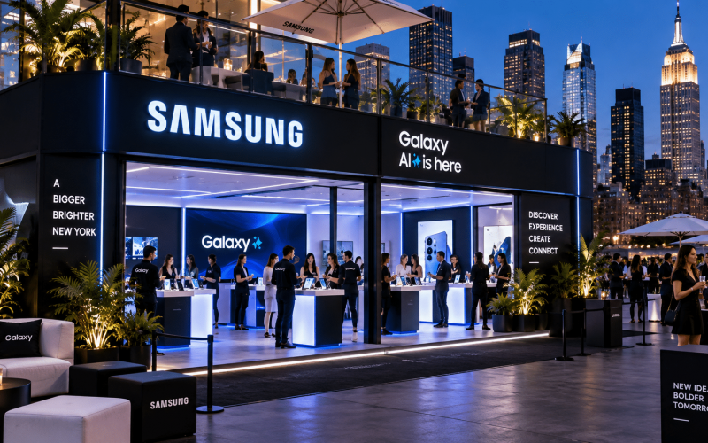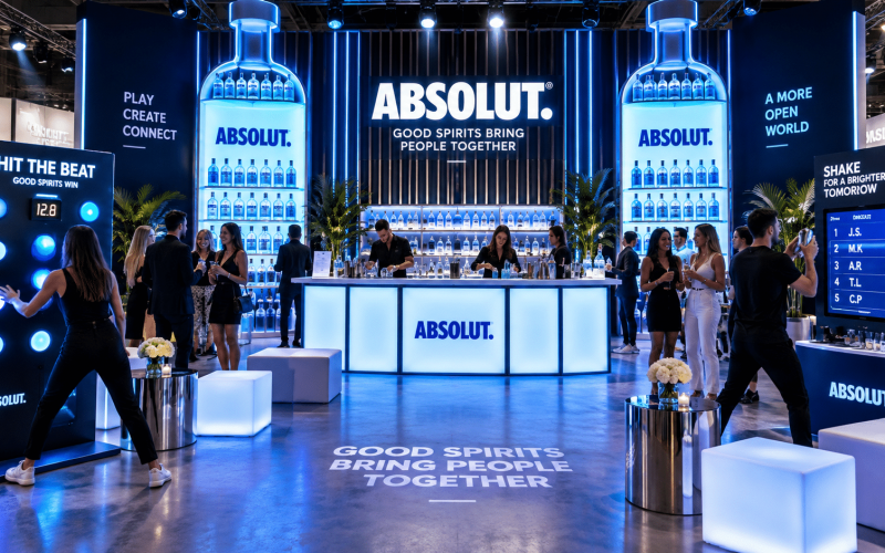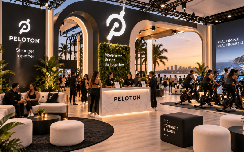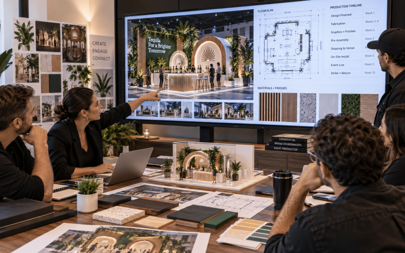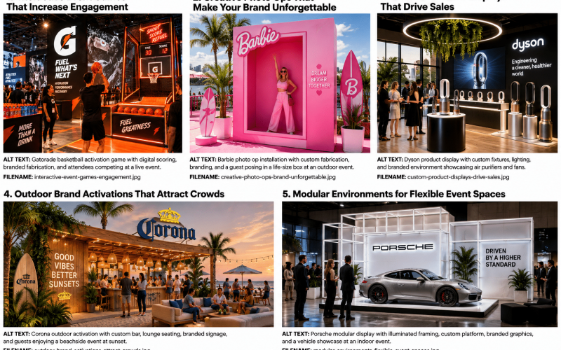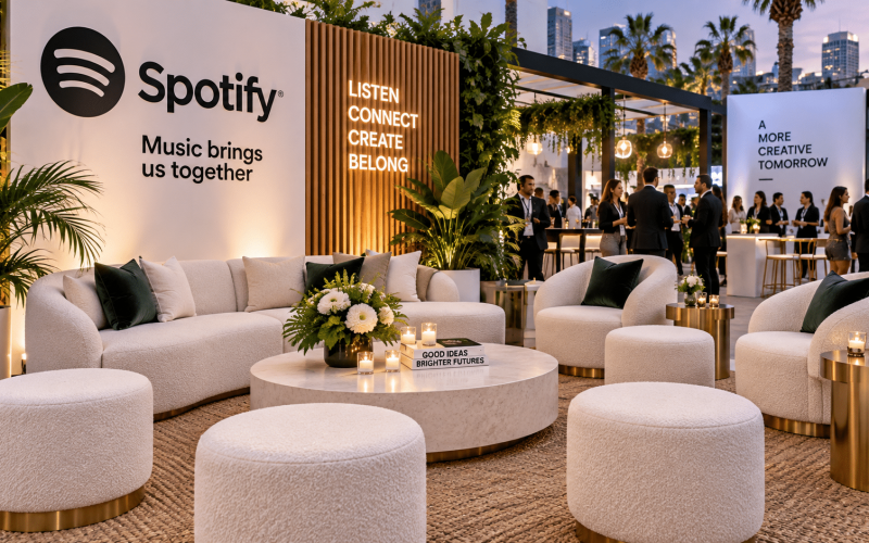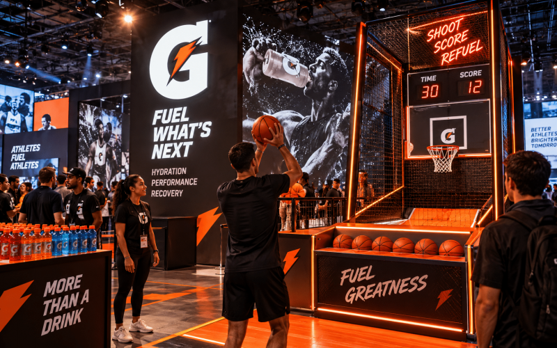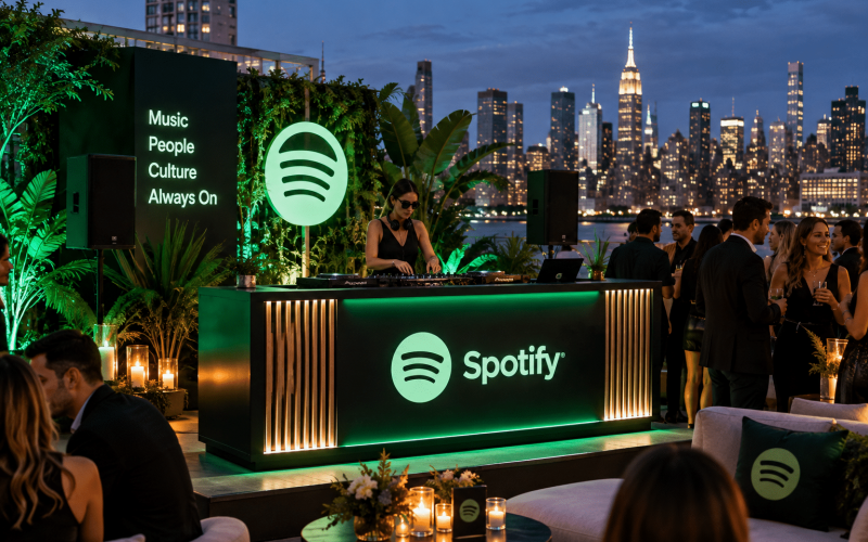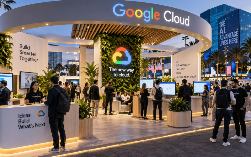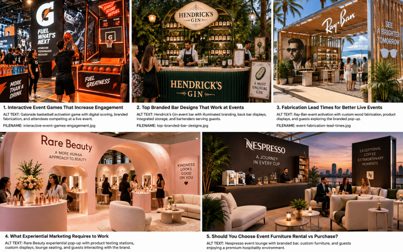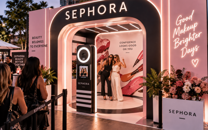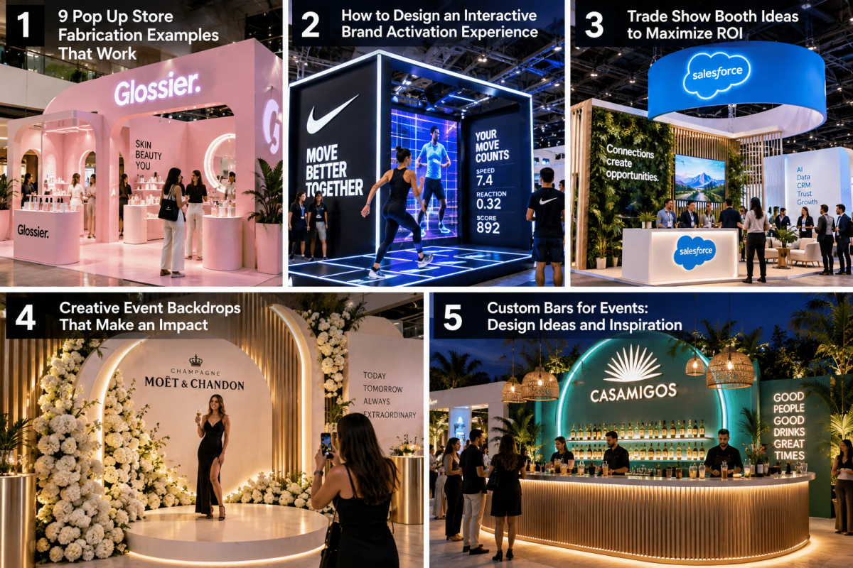
A pop-up can look impressive in a rendering and still fail on the show floor. The difference usually comes down to fabrication decisions: how guests enter, where products live, what staff can reset quickly, and whether every branded surface holds up to real use. These pop up store fabrication examples show how custom-built environments can turn a temporary retail footprint into a functional brand activation.
For marketing teams and agencies, the goal is not simply to build a small store. It is to create an experience that earns attention, communicates the product clearly, supports conversion, and can be installed within the constraints of a venue, street permit, mall, or event schedule. That requires creative intent and production discipline working together.
9 Pop Up Store Fabrication Examples Built for Results
1. The modular product discovery shop
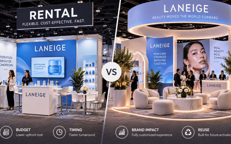
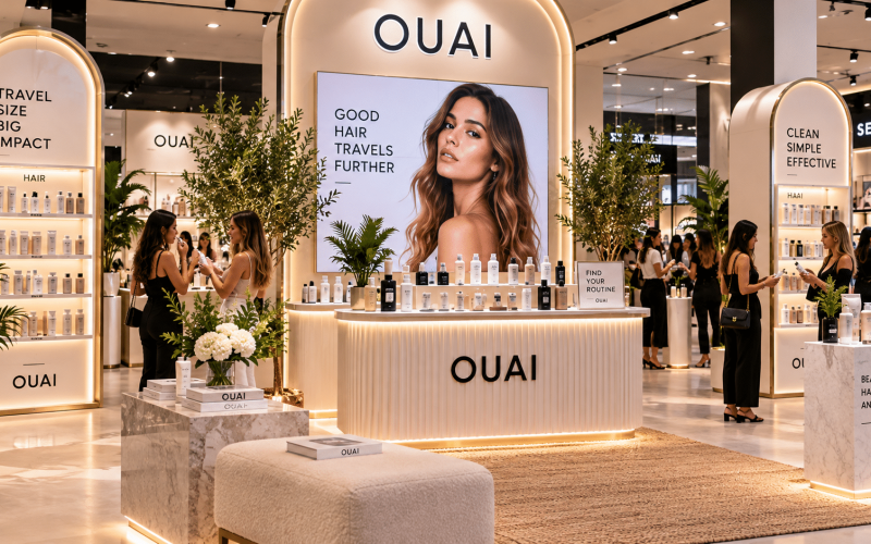
A modular product discovery shop uses fabricated wall bays, adjustable shelving, illuminated product ledges, and interchangeable graphics to organize a broad product assortment. It works especially well for beauty, consumer electronics, apparel, and food brands with multiple SKUs to feature.
The practical advantage is flexibility. The same structural system can be remerchandised for a new launch, moved into a trade show booth, or reduced for a smaller footprint. Custom fabrication keeps the components on-brand, while modular construction protects the investment beyond one event.
The trade-off is that modular pieces need disciplined early planning. Shelf dimensions, graphic zones, lighting locations, storage access, and packing methods should be determined before fabrication begins. A system that is flexible in theory but difficult to transport or reset will slow down the field team.
2. The walk-through product story
Some products need context before they need a sales counter. A walk-through pop-up uses a defined guest path, fabricated portals, product moments, and sequential messaging to move visitors from awareness to hands-on interaction.
For a new beverage, that might mean entering through a bold branded façade, learning about ingredients at an educational station, sampling at a central bar, and purchasing at the exit. For a technology launch, it may be a progression from problem to demonstration to consultation. The physical environment makes the message easier to absorb because the guest is moving through it.
Fabrication matters here because traffic flow cannot be treated as decoration. Wall placement, doorway widths, queue capacity, sightlines, and accessible routes all affect the experience. A visually striking layout that creates a bottleneck at the first interaction point will limit throughput and frustrate attendees.
3. The shoppable sampling bar
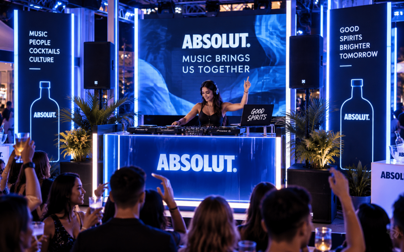
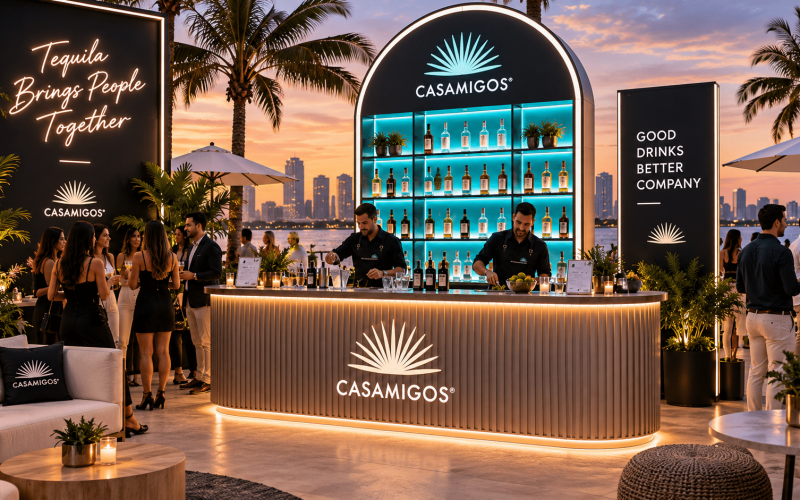
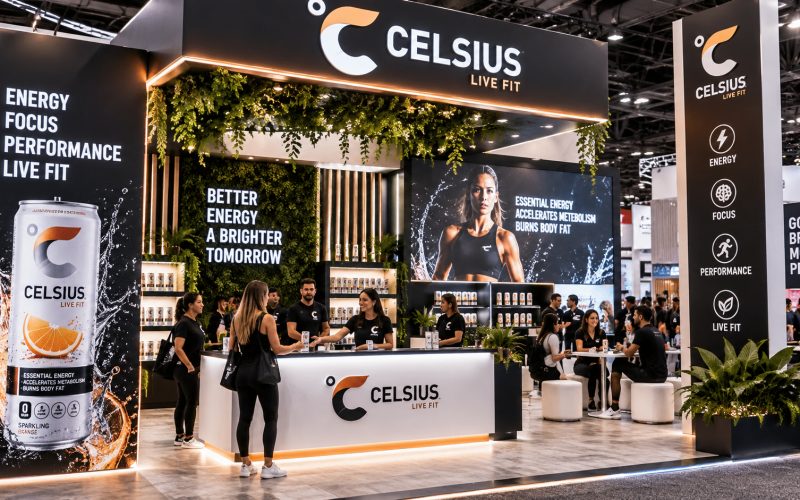
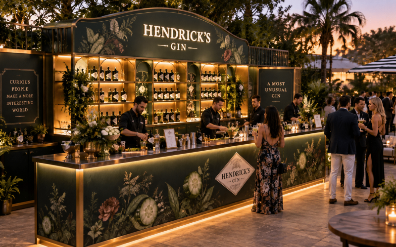
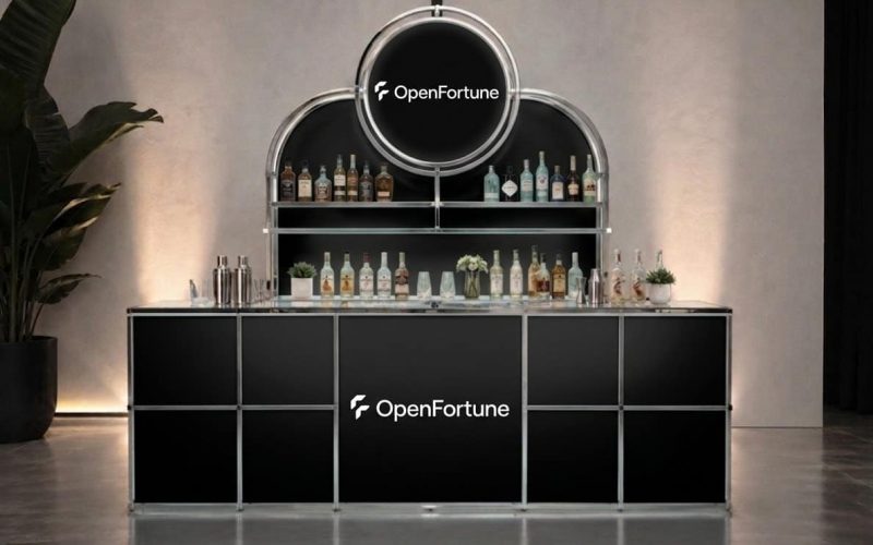
A sampling bar combines hospitality with retail, placing a product trial at the center of the pop-up. Fabricated counters can include refrigeration, concealed waste, lockable storage, washable work surfaces, menu signage, power distribution, and a branded front face that photographs well from several angles.
This format is valuable when a brand needs people to taste, test, smell, or compare before buying. It is common for food and beverage, beauty, wellness, and home goods campaigns. The counter becomes an operational workstation, not just a display fixture.
The best builds account for staff movement behind the bar. There must be enough clearance to restock, clean, manage lines, and store consumables without breaking the visual standard of the activation. If the bar is too shallow or storage is added as an afterthought, the space will look cluttered within the first hour.
4. The photo-forward brand set
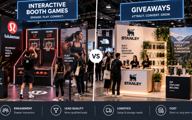
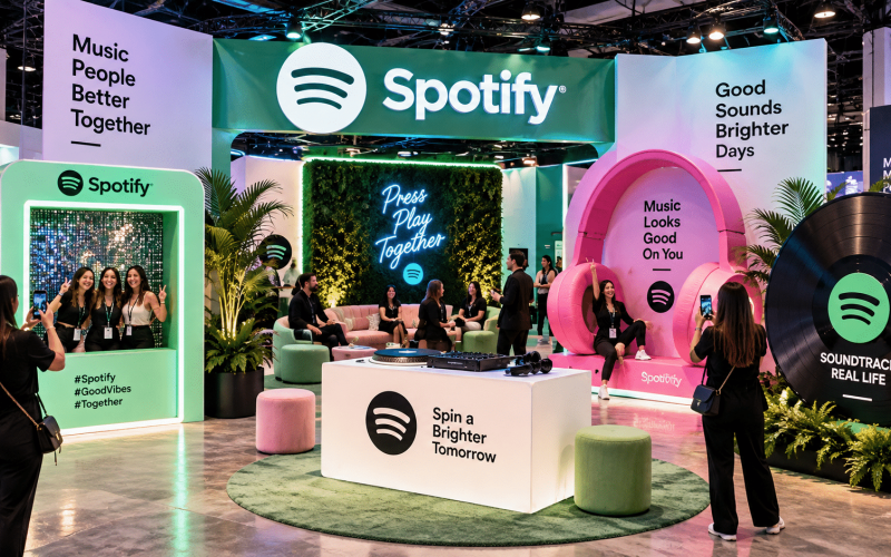
A photo-forward pop-up is built around a distinct visual moment: an oversized product replica, textured architectural backdrop, color-blocked room, sculptural display, or interactive light feature. Its job is to create a reason for guests to stop, capture content, and share a brand impression beyond the event site.
The photo moment should not be detached from the campaign objective. A fabricated set works harder when it also frames the product, supports sampling, introduces a limited edition, or directs guests to a lead-capture station. Otherwise, it can generate attractive images without providing a clear next step.
Durability is often overlooked in these concepts. Guests lean on walls, place bags on ledges, move stanchions, and repeatedly touch interactive surfaces. Fabricated elements need stable bases, protected finishes, safe edges, and replacement-ready graphic components. A polished finish is valuable, but it has to survive a high-touch environment.
5. The retail truck or mobile storefront
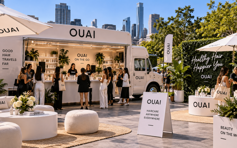
A mobile storefront brings the pop-up to different neighborhoods, campuses, festivals, or partner locations. Fabrication may include an exterior service window, fold-out counters, interior product walls, awnings, graphics, onboard power accommodations, and compact storage systems.
This is a strong option for a campaign that benefits from geographic reach or repeated appearances. A fixed pop-up can create depth in one market; a mobile build can create frequency across several markets. The right choice depends on the campaign’s audience, product, and staffing model.
Vehicle-based activations require more technical coordination than a standard ground-up footprint. Weight distribution, access points, weather exposure, permits, towing, and deployment time all shape the final design. The exterior may be the hero image, but the interior still has to support a team working efficiently in tight quarters.
6. The build-your-own product studio
A customization studio invites guests to select colors, finishes, accessories, messages, or packaging details. Fabricated worktables, display drawers, peg walls, material racks, and digital stations give the process structure while keeping it visually aligned with the brand.
This format creates participation rather than passive browsing. It is particularly effective for fashion, footwear, accessories, consumer tech, sports, and gifting campaigns. The guest leaves with a personalized item or a clear memory of having made something.
Operational details decide whether the experience feels premium. Build time per guest, material replenishment, staff sightlines, payment flow, and completed-product pickup need to be mapped before the build starts. A beautiful customization station can become a slow queue if every option is presented at one crowded counter.
7. The compact kiosk with oversized presence
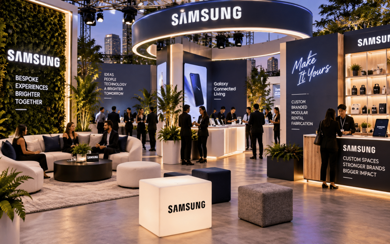
Not every pop-up needs four walls. A compact kiosk can use a fabricated canopy, dimensional logo, elevated product plinths, backlit signage, and a central service counter to create impact in a mall, concourse, lobby, or event hall.
The value is efficiency. A small footprint can still establish a strong brand presence when the architecture is intentional and the product story is focused. This approach is useful for limited-time promotions, product sampling, ticketed events, and high-traffic retail environments where square footage is limited.
Because the footprint is open, details are visible from every side. Cable management, counter backs, storage doors, and staff supplies cannot be ignored. Fabrication should provide clean concealed storage and finished surfaces throughout, not only on the guest-facing side.
8. The trade show-to-pop-up hybrid
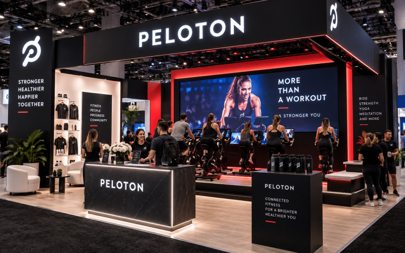
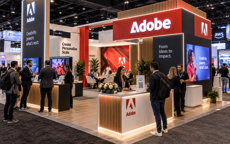
A hybrid system is designed to function first as a trade show booth and later as a pop-up shop, or the reverse. It might include reconfigurable walls, branded towers, lockable product displays, adaptable counters, and interchangeable graphics that fit several floor plans.
This is a practical answer for teams trying to extend the life of campaign assets. Instead of fabricating a one-time environment for each event, the brand develops a kit of custom products that can be refreshed and redeployed. It also helps maintain brand consistency across different markets and venues.
The compromise is visual specificity. A fully custom, site-specific store may feel more architecturally integrated than a reusable system. But when timeline, budget, and touring needs matter, a well-designed hybrid often delivers more value over the campaign life.
9. The community workshop and consultation space
For products that require education, a pop-up can operate like a workshop, clinic, or consultation studio. Fabricated workstations, semi-private conversation areas, presentation walls, demonstration tables, and appointment check-in points support deeper interactions than a typical retail display.
This format suits health and wellness brands, home improvement products, financial services, software platforms, and higher-consideration consumer goods. The environment needs to make visitors comfortable enough to ask questions while still communicating a confident brand identity.
Privacy and acoustics can matter as much as graphics. Partial walls, soft finishes, strategically placed storage, and deliberate room orientation can reduce distractions without making the space feel closed off. For consultation-led activations, the build should support trust as well as visibility.
What These Pop-Up Store Fabrication Examples Have in Common
The strongest concepts start with a clear visitor action. Should guests sample, shop, create, consult, scan, play, reserve, or share? Once that action is defined, the fabrication can support it with the right counters, displays, storage, technology integration, and circulation.
They also account for what happens after opening. Event environments need assets that can be loaded in, assembled, cleaned, repaired, branded, and broken down on schedule. Materials, joinery, graphics, and hardware should be selected for the actual run of the campaign, whether that is one day, one month, or a national tour.
A custom pop-up is most effective when the physical build makes the campaign easier to operate, not harder. Bring the visitor journey, product requirements, venue constraints, and timeline into the fabrication conversation early. That is where a temporary store becomes a reliable, high-performing brand environment.