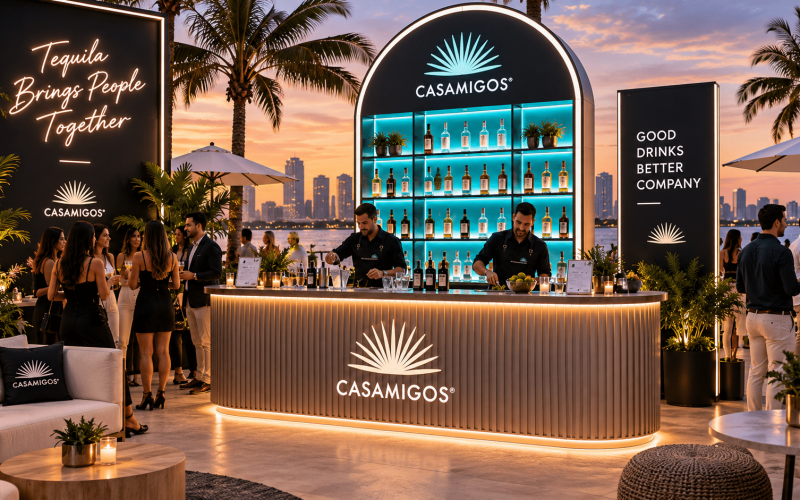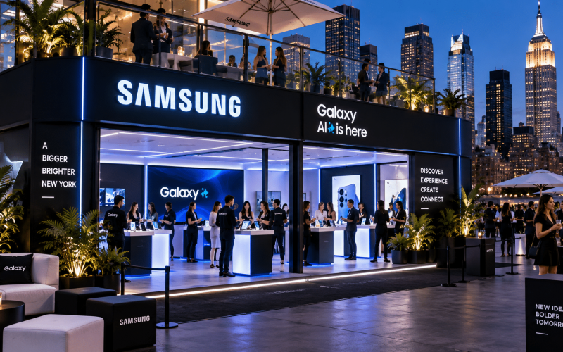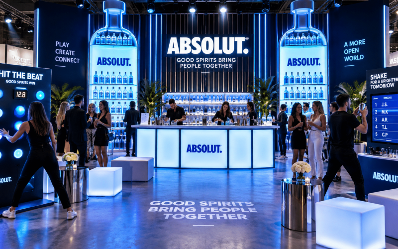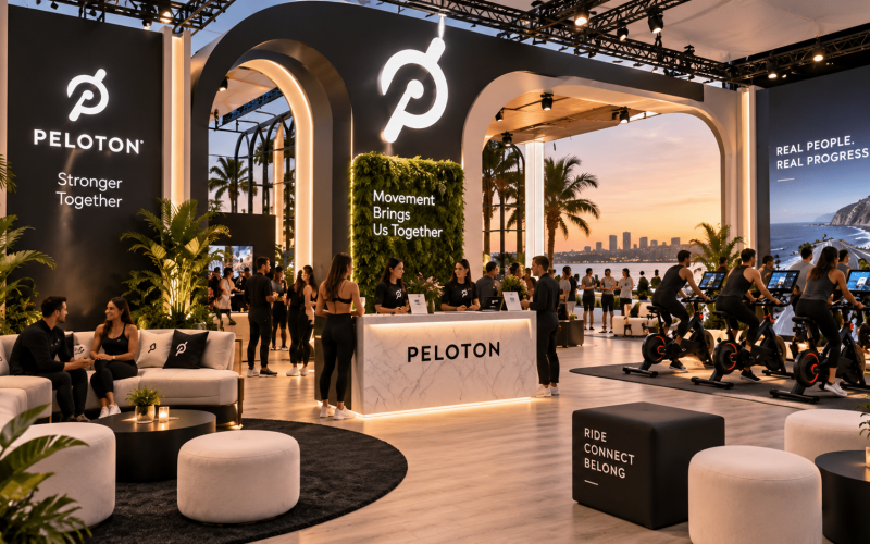
A launch can lose momentum the moment it reaches the retail floor. The campaign may be polished, the product may be ready, and the store may have traffic, but a weak physical presentation gives shoppers no reason to stop, understand, or engage. Retail launch displays close that gap by turning a product introduction into a visible, usable brand experience.
For brand marketers, agencies, and event teams, the challenge is not simply making a display look good in a rendering. It is producing an asset that communicates quickly, fits the retail environment, survives shipping and setup, and supports the way customers actually move through a space. That requires creative intent and fabrication discipline working together from the start.
What Retail Launch Displays Need to Accomplish
A retail launch display has a short window to earn attention. Whether it sits in a flagship store, a mall pop-up, a wholesale club, or a temporary branded environment, the structure needs to do more than hold product. It should establish what is new, why it matters, and what the customer should do next.
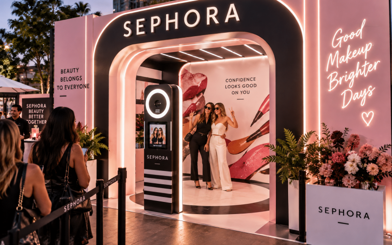
The strongest displays make the product easy to see and easier to understand. For a beauty launch, that might mean a tester station with illuminated product stories and clean storage for replenishment. For a consumer electronics launch, it may require secure demo units, integrated power, and a layout that lets several shoppers interact without creating a bottleneck. Food and beverage campaigns often need sampling surfaces, cold storage considerations, waste management, and clear traffic flow.
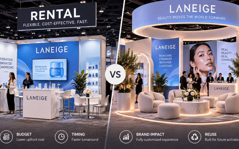
The display strategy depends on the product category, store format, staffing plan, campaign duration, and budget. A temporary three-day launch can prioritize fast setup and visual impact. A multi-week retail program needs durable finishes, replaceable graphics, accessible inventory storage, and a practical reset process for store teams.
Start With the Retail Environment, Not the Rendering
A compelling concept is only useful if it works in its intended footprint. Before fabrication begins, teams should confirm the dimensions, ceiling clearances, store access routes, delivery restrictions, electrical availability, floor conditions, and retailer requirements. These details shape the design more than most early concepts account for.
A display built for a generous open floor plan may fail in a narrow aisle. A tall feature wall can be effective in a flagship location but impractical in a location with strict sightline rules. Even a well-designed counter can become a problem if it cannot fit through the loading dock, service elevator, or back-of-house corridor.
This is where early production input protects both the idea and the budget. A fabrication partner can identify where a concept needs modular construction, lighter materials, knockdown components, or concealed leveling hardware. That does not mean compromising the creative. It means engineering the creative for the conditions where it has to perform.
Design for the shopper’s first five seconds
Shoppers do not approach a launch display with a briefing document. They make fast decisions based on color, silhouette, product visibility, messaging hierarchy, and whether the interaction appears intuitive.
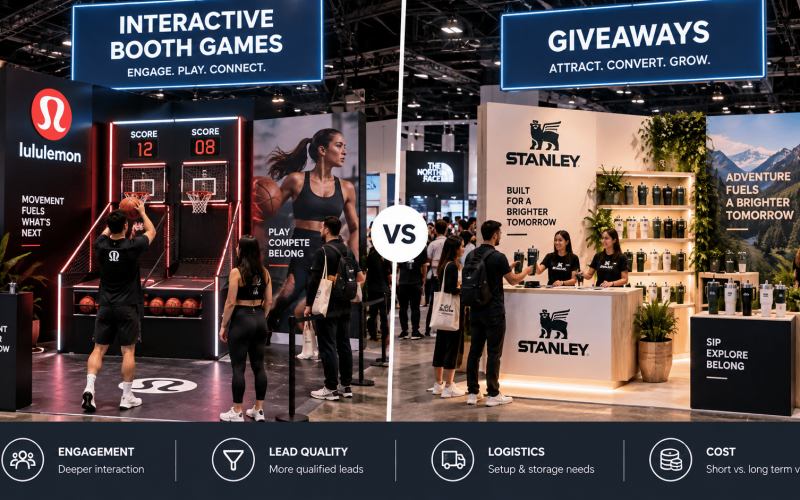
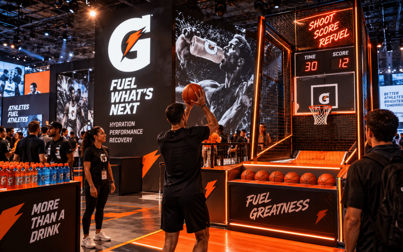
The focal point should be apparent from the primary approach angle. Brand messaging should be readable at the appropriate distance, while product details can live closer to the fixture. If the experience includes a digital screen, sampling mechanic, game, or product demo, the invitation to participate must be obvious without requiring staff explanation.
Avoid treating every surface as media space. Overloaded graphics can make a display feel less premium and obscure the actual product. Strong launch environments use hierarchy: one clear launch message, a visible product moment, and a direct action such as try, scan, sample, compare, or purchase.
Build for Operations as Carefully as Aesthetics
Retail teams notice the operational shortcomings that a customer never sees in a pitch deck. Where does backup inventory go? How are charging cables concealed? Can staff clean the surface quickly? Is the display stable when shoppers lean on it? Can a damaged graphic panel be replaced without taking the entire unit out of service?
These questions should guide material and construction choices. Painted MDF, laminates, acrylic, metal, vinyl graphics, printed fabric, and LED elements all serve different purposes. The right specification depends on the desired finish, expected wear, weight limits, lead time, and reuse plan.
For example, a high-gloss acrylic finish can create a sharp premium look, but it may show fingerprints and scratches in a high-touch environment. A laminate can be more forgiving for an extended retail run. Fabric graphics can reduce shipping volume and make creative swaps easier, while rigid panels may provide a more architectural result. There is no universal best material. The practical choice is the one that supports the campaign goal and the operating reality.
Include access, storage, and service points
Good fabrication makes functional components feel intentional. Lockable cabinets, cable routing, removable rear panels, hidden casters, and replaceable graphic skins can all be integrated without weakening the visual impact.
When displays include technology, plan beyond the screen. Consider power draw, device security, ventilation, network access, cable management, startup procedures, and staff troubleshooting. A digital element that cannot be reset quickly can create a poor customer experience and an unnecessary burden for retail personnel.
For sampling or demonstrations, provide enough work surface for staff while keeping the customer-facing side clean. If the brand expects product replenishment throughout the day, storage should be accessible without forcing staff to leave the activation area repeatedly.
Plan Fabrication and Logistics as One Scope
Retail launch schedules are often compressed. Creative approvals arrive late, retailer requirements change, and installation windows can be narrow. Separating design, fabrication, freight, and install planning creates avoidable risk because each decision affects the next.
A display that looks efficient to fabricate may be expensive to ship if it exceeds standard freight dimensions. A unit that travels well may take too long to assemble if the installation sequence has not been considered. A modular approach can solve both issues, but only when the connection points, packaging, labeling, and setup instructions are designed into the build.
For multi-location programs, consistency is as important as visual impact. Every kit should include clearly labeled components, spare hardware, graphic protection, assembly directions, and a defined packing order for return or redeployment. If different store footprints require variations, create a family of components rather than treating every location as a completely separate build.
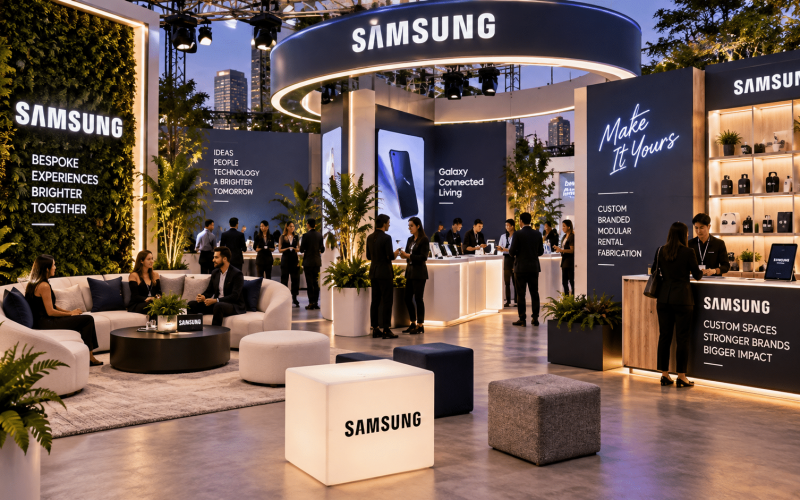
Portadecor approaches this work as an experiential production challenge, combining custom fabrication with the practical requirements of live environments. That means evaluating how an asset will be built, moved, installed, used, and maintained – not only how it will photograph on launch day.
Make the Display Worth Measuring
Not every retail display needs a complex data program, but every launch should have a defined purpose. Is the priority product trial, dwell time, lead capture, social content, conversion, sampling volume, or retailer visibility? The answer influences the physical design.
If product trial is the goal, track samples distributed, demos completed, or tester interactions. If lead capture matters, ensure the registration point does not block the main product experience. If the objective is content creation, build a branded visual moment with intentional lighting, a clear camera angle, and enough room for customers to participate without disrupting traffic.
Measurement also improves the next rollout. Store team feedback can reveal whether messaging was clear, inventory storage was adequate, setup took longer than expected, or a popular interaction created congestion. These insights are often more useful than a general impression that the display “looked great.”
Common Mistakes That Reduce Launch Impact
The most expensive mistake is approving a display based only on appearance. A polished rendering cannot confirm stability, assembly time, sightlines, freight constraints, or how the surface will hold up after hundreds of customer interactions.
Another common issue is designing too much into a small footprint. A launch area may need product display, demo space, storage, digital content, signage, and staff workspace, but forcing all of it into one compact unit can make the experience confusing. In some cases, a smaller number of well-resolved components will perform better than one overloaded structure.
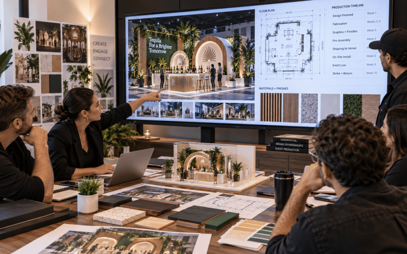
Teams also underestimate the value of a prototype, finish sample, or pre-install review. For high-visibility launches, checking scale, materials, graphics, lighting, and functionality before final production can prevent costly corrections at the retail site.
The right first question is not, “What can we fit into this space?” It is, “What must a shopper understand, feel, or do here?” Build the display around that answer, then let fabrication, logistics, and retail operations turn the idea into an experience that holds up after opening day.