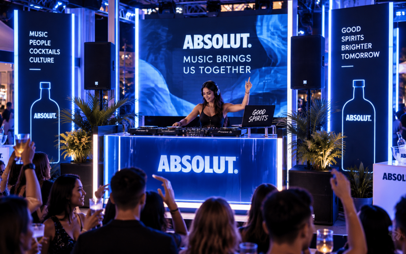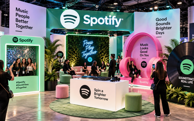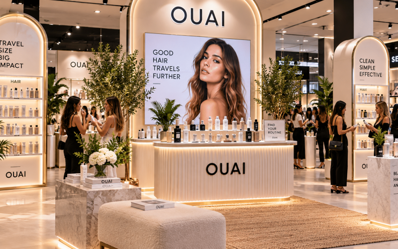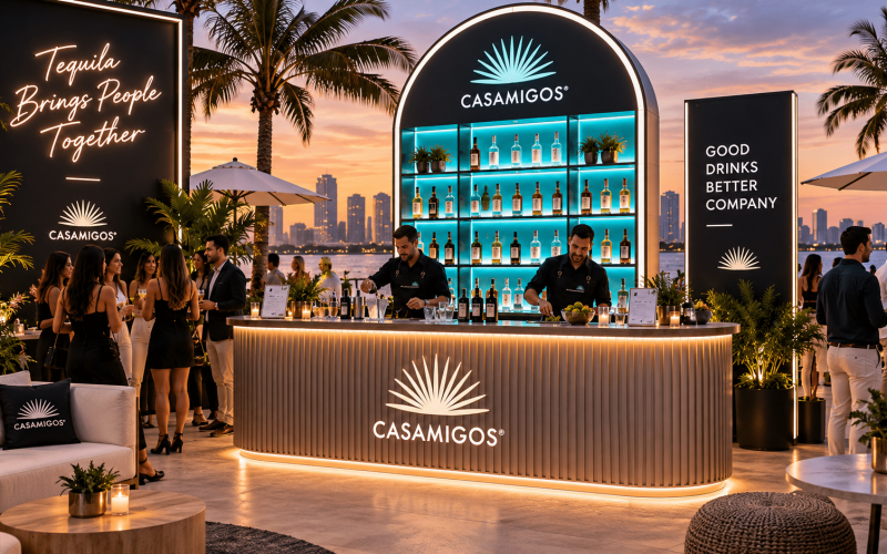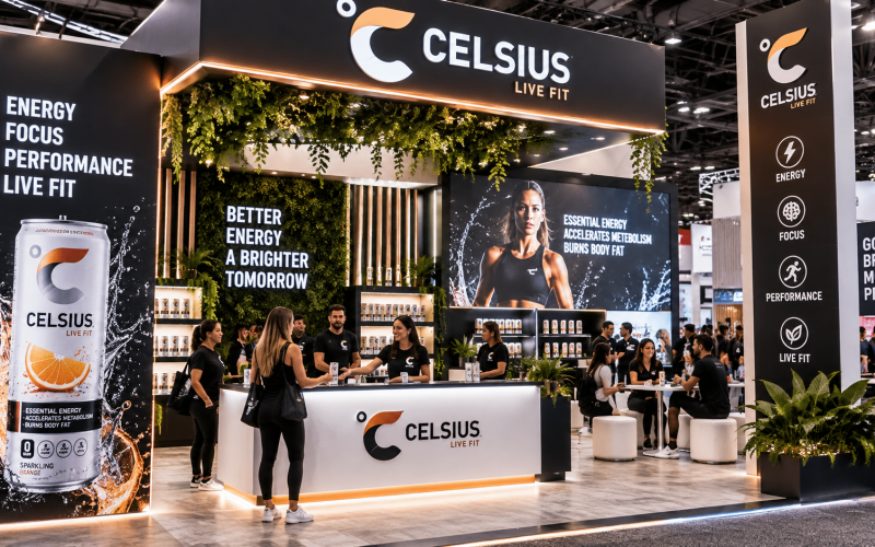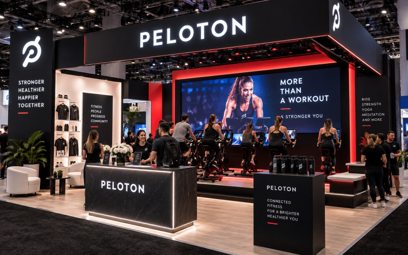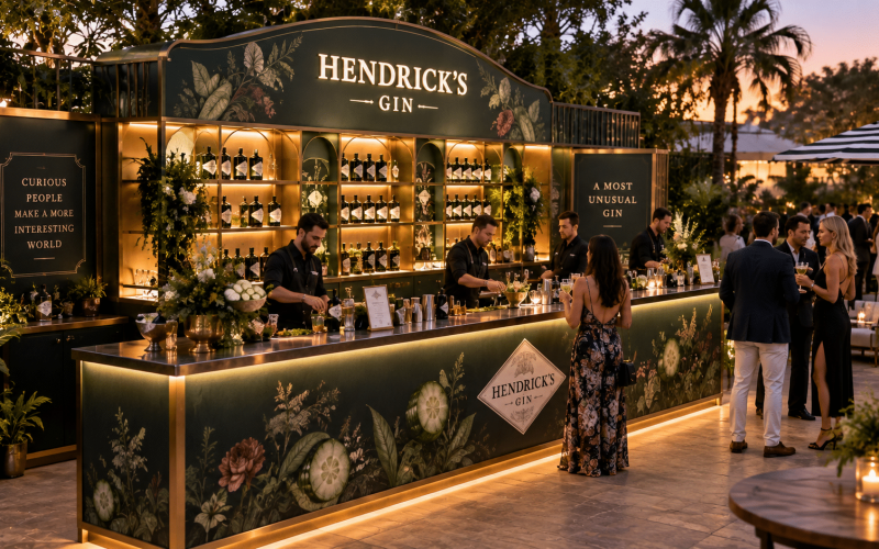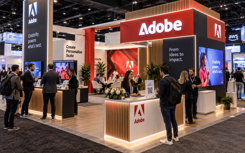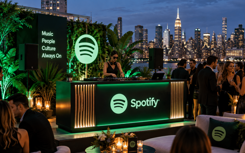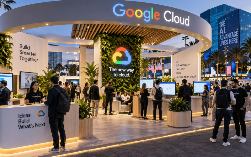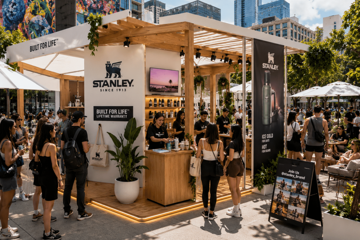
A popup that looks good on a mood board can still fail on the floor. The usual problem is not creativity. It is planning. If you are figuring out how to plan experiential popups, the real work starts well before fabrication, rentals, staffing, or load-in. Strong popups are built around clear objectives, audience behavior, and production realities from day one.
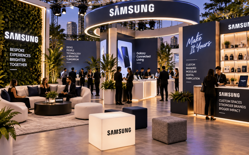
For brand teams and agencies, that means treating the popup as an operating environment, not just a branded footprint. Every decision – from layout to materials to interactivity – affects engagement, setup time, staffing needs, and overall ROI.
Start with the business goal, not the footprint
The fastest way to waste budget is to begin with the question, “What should the space look like?” A better question is, “What should this popup do?” Some popups are meant to drive product trial. Others exist to generate social content, capture leads, support a launch, or give a campaign a physical presence in a high-traffic location.
That goal should shape the format. A sampling-first activation needs traffic flow, replenishment planning, and simple messaging. A lead-generation popup needs a reason to stop, a clear capture process, and a staff setup that can handle real conversations. A retail-adjacent popup may need merchandising, storage, and durable fixtures that can survive repeat use.
This is also where internal alignment matters. If the brand team wants awareness, the sales team wants qualified leads, and the agency wants a highly visual centerpiece, those priorities need to be reconciled before design development starts. Popups tend to struggle when they are asked to do everything at once.
How to plan experiential popups around audience behavior
Good experiential planning is less about what the brand wants to show and more about how people will move, pause, participate, and remember. That starts with understanding the audience in practical terms. Are they passing by with ten seconds to spare, or arriving with intent? Are they likely to interact alone, in groups, or with children? Do they need staff guidance, or should the experience be self-directed?
These questions affect the physical build. If you expect short dwell times, the activation needs immediate visual clarity. If you want deeper engagement, you need enough space and structure to support it without creating bottlenecks. If social sharing is part of the strategy, the camera moment cannot be an afterthought tucked into the corner.
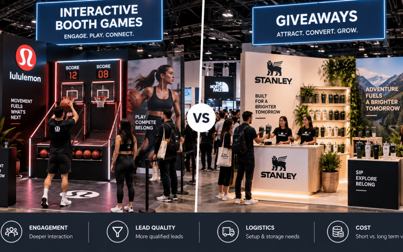
There is always a trade-off between spectacle and usability. Large scenic elements can create visibility from a distance, but they can also consume valuable square footage. Interactive elements can increase dwell time, but they also introduce power needs, maintenance concerns, and possible staffing demands. The right answer depends on the objective, venue conditions, and expected volume.
Choose the right site before you design too much
Teams often get attached to a concept before the site is fully understood. That creates expensive revisions later. Venue rules, ceiling heights, power access, load-in paths, floor conditions, and operating hours all have a direct effect on fabrication and installation.
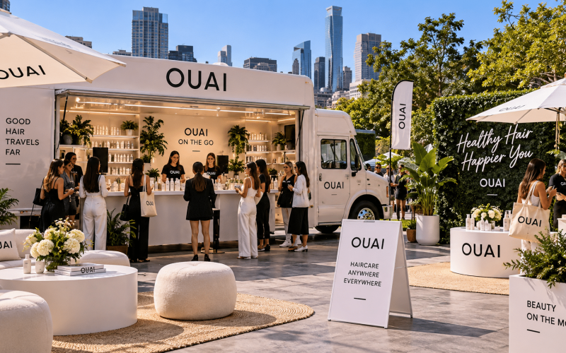
A popup in a shopping district has a different planning logic than one inside a convention center or a branded takeover at an existing event. Outdoor sites introduce weather, ballast, material durability, and lighting considerations. Indoor sites can still be restrictive if access is limited or if union labor, venue approvals, or fire code requirements are in play.
This is why site validation should happen early. A concept that depends on hanging signage, built-in refrigeration, or oversized scenic walls may need to be adapted if the venue cannot support it. Planning around real conditions is not a creative compromise. It is what keeps the final execution strong.
Build the experience from the center out
Once the goal and site are clear, the next step is to define the central interaction. This is the core moment people are there to experience. It could be a game, product demo, tasting, customization station, lounge moment, content capture area, or a guided brand story.
Everything around that moment should support it. That includes entry points, branded messaging, line management, storage, staff positions, and any secondary touchpoints. A common mistake is overloading the footprint with too many competing features. When everything is interactive, nothing stands out.
A tighter plan usually performs better. One strong hero experience with clear supporting elements tends to generate better engagement than a crowded layout with mixed signals. If multiple components are necessary, they should be sequenced intentionally so the audience understands where to go and what to do next.
Design for fabrication, transport, and reuse
This is where popup planning moves from concept to execution. Custom fabrication can elevate an experience dramatically, but only if the design accounts for production realities. Materials, finishes, assembly methods, shipping dimensions, and install conditions all matter.
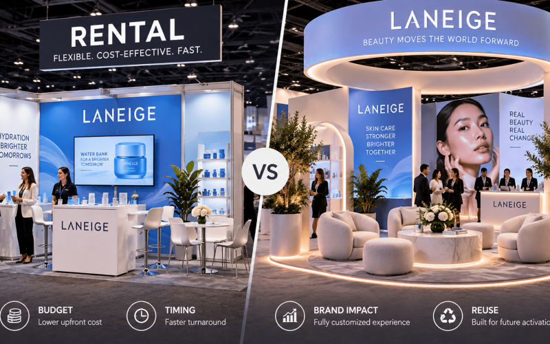
For one-off activations, the build may prioritize a highly specific branded look. For touring popups or multi-market campaigns, modularity becomes more important. Components may need to pack efficiently, reassemble quickly, and adapt to different footprints. A beautiful structure that takes too long to install or requires specialty handling at every stop can hurt the program financially.
Reusable assets also deserve a serious look. In many cases, a hybrid approach works best: custom-built hero pieces combined with rental furniture, standard counters, or adaptable scenic components. That balance helps control budget without sacrificing visual impact. It also reduces the need to fabricate every element from scratch.
If your team is working on a national rollout, fabrication choices should account for repetition, wear, and repair. High-touch surfaces, game elements, counters, and branded fixtures need to hold up under use, not just look good on render day.
Budget beyond the obvious
Most teams budget for design, fabrication, shipping, venue fees, and staffing. The trouble starts with the secondary costs. Electrical distribution, contingency materials, on-site touch-up, waste removal, drayage, overnight security, storage, and strike labor can quietly change the economics of a popup.
This is another reason early production involvement matters. The more precisely the experience is scoped, the easier it is to identify cost pressure before it becomes a problem. Sometimes the smarter move is simplifying one scenic area in order to protect a higher-performing interactive element. Sometimes reducing footprint size improves efficiency without reducing impact.
Budget discipline should not flatten the experience. It should help prioritize what actually drives results. If a branded wall looks impressive but contributes little to engagement, that spend may be better redirected into product interaction, staff training, or a better-fabricated focal point.
Plan operations as carefully as the visuals
A popup succeeds or fails in live conditions. That is why operations deserve the same attention as creative. Think through setup windows, replenishment, storage access, power management, cleaning, ADA considerations, line flow, and staff handoffs.
Staffing should match the experience design. If the activation depends on explanation, facilitation, or content capture, not just greeting, then labor needs to reflect that. If the layout creates a queue, someone needs to manage it. If product handling is involved, there should be a defined back-of-house process.
Tech should also be treated realistically. Screens, sensors, tablets, and game mechanics add value when they are stable and easy to support. They become liabilities when there is no backup plan. In experiential, reliability is part of the brand experience.
Measure what the popup is supposed to achieve
If you want to know how to plan experiential popups well over time, measurement has to be built in before launch. The KPI should match the original objective. That might mean dwell time, samples distributed, qualified leads, UGC volume, appointment bookings, sales lift, or foot traffic conversion.
Not every popup needs a complex data stack. But every popup does need a defined way to evaluate performance. Otherwise, teams end up judging success by appearance alone. A visually strong environment that does not drive participation may be less effective than a simpler footprint that gets people to engage.
Post-event review is where the next program gets better. Which elements pulled people in? Where did congestion happen? What required more staff support than expected? Which fabricated assets are worth reusing? These are operational insights, not just observations, and they improve future execution.
Work backward from launch day
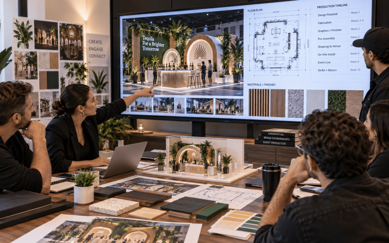
The most practical way to keep a popup on track is to reverse-engineer the schedule. Start with the event date, then map approvals, design lock, engineering, fabrication, graphics production, rentals, logistics, and contingency time. Popups rarely get easier when compressed. They get riskier.
That is especially true when custom products are involved. Fabrication lead times, finish approvals, and shipping windows need room to breathe. A capable production partner can help flag risk early, adjust specifications, and align the build with venue realities before they become expensive surprises.
When Portadecor supports popup execution, that planning discipline is a big part of the value. Strong experiential environments are not just designed well. They are fabricated, installed, and supported with the event itself in mind.
The best popup plans are not the most complicated ones. They are the ones where the concept, footprint, fabrication, and operations all point in the same direction – toward a branded experience people actually want to step into.