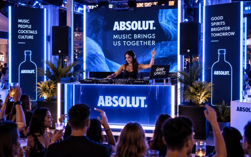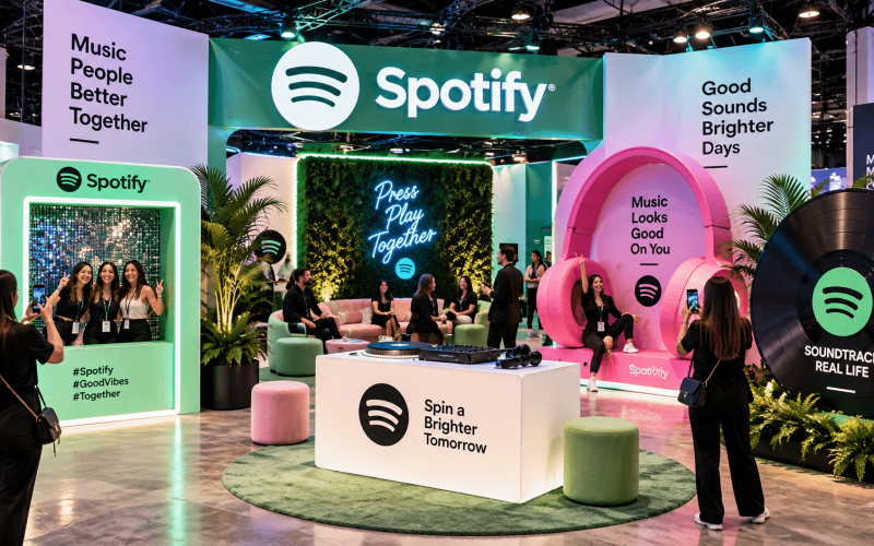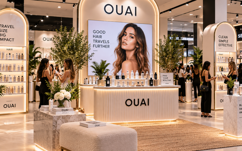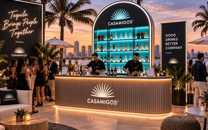
A retail pop-up can have the right product, a strong location, and a polished campaign concept, then lose momentum because the fixtures are working against the experience. Tables that are too deep create a barrier. Shelving that cannot carry inventory looks picked over by noon. A branded wall that takes hours to assemble can consume the install window before the merchandising team arrives.
This retail pop up fixture guide is built for brand teams, agencies, and event producers who need physical retail environments to look intentional, operate efficiently, and travel without becoming a production liability. The right fixture package does more than hold products. It directs attention, supports staff, carries brand cues, and gives shoppers a reason to stop.
Start With the Customer Journey, Not the Fixture Catalog
Fixture selection should begin with the action you want visitors to take. Are they sampling a new product, comparing colorways, checking out, booking a service, or creating content? Each action requires a different level of access, dwell time, and staff support.
For a product launch, a central hero fixture may be the focal point: a plinth, display table, lit case, or sculptural product stand. For high-volume sampling, the priority shifts to accessible service counters, storage, and a queue that does not block the shopping area. A pop-up selling multiple SKUs needs clear product grouping and enough replenishment capacity to avoid constant trips to backstock.
Map the experience in sequence: approach, first impression, product discovery, engagement, conversion, and exit. Fixtures should make that path obvious without relying on temporary signs at every turn. If guests have to ask where they should begin, the floor plan is doing too little work.
Define the role of every fixture
A productive floor plan gives each element a job. A display table can invite hands-on interaction. Wall shelving can carry depth of inventory without crowding the center of the room. A counter can handle checkout, demonstrations, lead capture, or all three if it is designed for the workflow.
Avoid adding pieces simply to fill open space. Open space can be useful when it creates visual breathing room, allows accessible circulation, or makes the hero product more visible. The better question is not, “What else can go here?” It is, “What does the guest need to do here?”
Choose a Fixture System That Fits the Event Reality
A beautiful fixture is not automatically the right fixture. Retail pop-ups operate under constraints that permanent stores do not: short load-in windows, freight limits, public-facing durability, venue rules, staffing changes, and sometimes multiple stops on a tour.
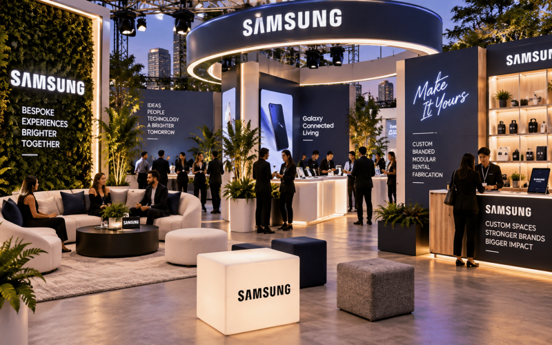
Custom fabrication is often the right choice when the fixture itself is part of the campaign. A custom display can match a launch’s forms, colors, materials, and storytelling in a way off-the-shelf equipment cannot. It is also useful when a product has unusual dimensions, requires integrated lighting or power, or needs a distinctive interaction built into the environment.
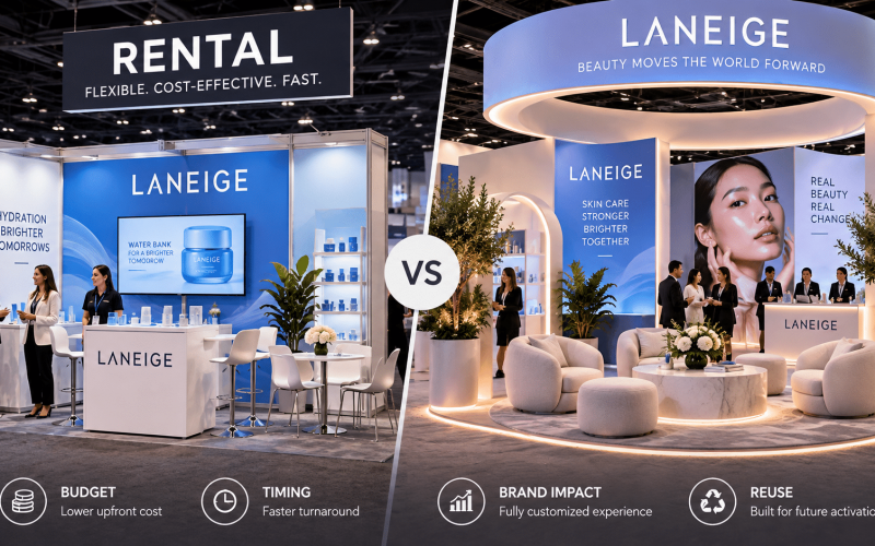
Rental fixtures can be the more efficient choice when the schedule is tight, the footprint is temporary, or the campaign needs reliable foundational pieces such as counters, shelving, tables, seating, and back-of-house support. The strongest programs often combine both: custom focal assets that make the activation recognizable, paired with rental components that keep the build practical and budget-conscious.
For touring activations, prioritize modularity. Components should pack predictably, withstand repeated assembly, and allow replacement parts or graphic updates without rebuilding the entire environment. A fixture that looks exceptional at the first stop but is difficult to repair or transport will add cost and risk at every later market.
Build for Visibility at Three Distances
Pop-up fixtures need to communicate from across the venue, from the edge of the retail area, and from arm’s length. Those are three different design problems.
From a distance, the retail environment needs a clear silhouette and a recognizable branded moment. This may be a dimensional logo, a tall backdrop, an illuminated sign, a color-blocked structure, or an elevated product display. The goal is to give passing attendees a reason to change direction.
At mid-range, fixtures should explain what is available and where to go. Product categories, sampling areas, fitting or consultation points, and checkout should be legible without turning the space into a field of signs. Use heights and forms to establish hierarchy. Not every fixture should compete for attention.
At close range, material quality matters. Guests notice edge details, surface wear, fingerprints, loose graphics, exposed hardware, and cluttered cables. This is where fabrication quality reinforces brand quality. If a campaign asks customers to view a product as premium, the display cannot feel temporary in the wrong way.
Plan Dimensions Around Products, People, and Replenishment
A fixture that is technically attractive can still fail because its dimensions do not support real use. Display surfaces must accommodate the product, packaging, signage, and the customer’s hands. Counters need appropriate working height for staff, equipment, and customer interaction. Shelves need both visual capacity and structural capacity.
Consider the volume of inventory required between replenishments. A display that holds only a few units may work for a luxury item with guided selling. It creates problems for a fast-moving consumer product, apparel assortment, or open-sell merchandise. Hidden storage, lower cabinets, and backstock zones keep the customer-facing area organized while giving staff what they need to operate.
Traffic flow is equally important. Leave enough clearance for customers to browse without backing into other guests or disrupting a demo. Keep high-touch areas away from pinch points. If a queue is likely, give it a defined location rather than allowing it to form across the main entry.
Accessibility should be considered from the first layout review. Reach ranges, counter heights, circulation paths, and viewing angles affect whether more guests can comfortably participate. Treat these requirements as design inputs, not a late-stage compliance exercise.
Integrate Brand Graphics Without Sacrificing Function
Branding can be built into fixtures through color, dimensional logos, custom finishes, printed panels, vinyl, fabric graphics, digital screens, and product-specific forms. The best approach depends on how frequently the fixture will be used and how likely the campaign is to change.
For a single launch or a tightly controlled visual identity, permanent branded surfaces can create a strong, cohesive environment. For an agency or brand team planning multiple campaigns, interchangeable graphic panels are often more useful. They allow a durable fixture frame to support new launches without starting from zero.
Do not place graphics where hands, bags, carts, or product replenishment will destroy them. Similarly, do not let oversized logos interfere with access to products. Branding should clarify the experience, not turn every usable surface into an ad placement.
Lighting and power need the same level of planning. Integrated lighting can improve product presentation significantly, particularly for cosmetics, accessories, food, beverage, and reflective finishes. But it also introduces cable management, electrical load, assembly time, and venue coordination. Design those needs into the fixture rather than running extension cords across the floor at the last minute.
Account for Load-In, Labor, and Venue Conditions
Before approving a fixture design, confirm how it gets from the truck to the event floor. Measure doorways, elevators, loading docks, freight paths, and any tight turns. Ask whether the venue has labor restrictions, union requirements, floor protection rules, or limits on drilling, adhesives, and wall attachment.
A fixture package should include practical installation thinking: how many people are needed, what tools are required, how long assembly takes, and what happens if one component is delayed or damaged. This is especially relevant for trade show booths and mall pop-ups, where the install schedule can be compressed and access can be limited.
Durability should match the event’s intensity. A one-day media preview may allow more delicate finishes than a two-week public pop-up with thousands of visitors. High-touch surfaces should be easy to clean. Corners should handle carts and luggage. Casters, where appropriate, should lock securely and remain discreet. If children, crowds, or active demonstrations are part of the experience, stability becomes a primary design requirement.
Use a Fabrication Partner Early Enough to Improve the Plan
The most useful fabrication partner is involved before every visual decision is fixed. Early collaboration can identify where a concept needs structural support, how graphics can be changed between markets, what materials will hold up in transit, and where production costs can be controlled without weakening the brand moment.
Portadecor supports this process by translating branded concepts into custom products, activation environments, and event-ready fixture packages. For nationwide fabrication and activations, that means balancing the creative brief with the realities of transport, installation, and public use.
Bring the core inputs to the first production conversation: floor plan, venue information, product dimensions, expected attendance, brand standards, timeline, budget range, and whether the assets will travel. A clear brief reduces revisions, but it should still leave room for fabrication expertise to improve the final build.
The fixture choices that perform best are rarely the loudest or the most numerous. They are the pieces that make products easy to discover, staff easy to support, and the brand easy to remember long after the pop-up closes.